Thursday, 16 April 2020

Time Series Analysis with ARIMA: Part 3

XI. Cisco Use Case – Forecasting Memory Allocation on Devices


Background: Cisco devices have a resource limit (rlimit), based on their OS and platform type. When a device reaches its resource limit, it might indicate harm in the network or a leak. High water mark is used as a buffer to the resource limit. It is a threshold, that if it reaches the resource limit, indicates a problem in the network. For more information on high water mark, here is a useful presentation on what it means for routers and switches.

Problem: The client wants to track and forecast high water mark over a two-year period. We need to determine if/when high water mark will cross the resource limit two years into the future.

Solution: To solve this problem, we used time series forecasting. We forecasted high water mark over a two-year period.

A lot of effort went into thinking about the problem. I will put the general steps we took in solving this before going into the details. Notice that most of these steps were mentioned or highlighted in the first two blogs!

1. First, we looked at and plotted data
2. Second, we formulated hypotheses about the data and tested the hypotheses
3. Third, we made data stationary if needed
4. Fourth, we trained many separate model types and tested them against future values for validation
5. Finally, we gave conclusions and recommendations moving forward

1) Looked at and Plotted Data

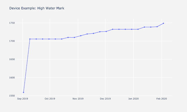
When we initially received the dataset, we received numerous variables in addition to high water memory utilization over time. We received 65 devices and for each device, we were given about 1.5 years of data in monthly snapshots. Below is information on one example Cisco device. Note the variables labeled X and Y (timestamp and “bgp_high_water”). These are the variables we are interested in using for our forecast. The “bgp_high_water” variable is represented in bytes.

Cisco Prep, Cisco Tutorial and Material, Cisco Learning, Cisco Certification

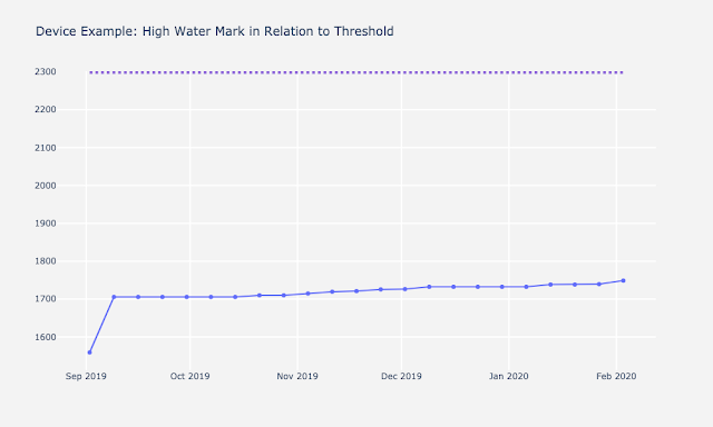
We then plotted data of all devices. Below is an example device highlighting the importance of visualization. Depending on how you look at the data can make immense difference in the interpretation of it. The graph on the right is plotted with respect to the resource limit, which makes the variability in bytes look much less extreme than it appears on the left. These graphs inform us the steepness of the rise of high water mark over time and became critical when interpreting forecasts and predictions with different models.

Cisco Prep, Cisco Tutorial and Material, Cisco Learning, Cisco Certification

Cisco Prep, Cisco Tutorial and Material, Cisco Learning, Cisco Certification

2) Formulated hypotheses about the data and test the hypotheses

We faced two big challenges when we looked at these data points on a graph.

Challenge #1: The first challenge we faced was related to the number of data points per device. We only had monthly snapshots of memory allocation over ~1.5 years. This means we had about 15 data points on average per device. For a successful time series analysis, you need least 2 to 3 years’ worth of data to predict 2 years out, which would mean we would need at the very least 24-36 data points per device. Because we didn’t have much data, we could not confidently or reliably trust seasonality and trend detection tests we ran. This issue can be resolved with more data, but at the time we were given the problem, we could not trust the statistics completely.

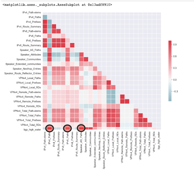
Challenge #2: The second challenge we faced was related to how we could use extra variables as leading indicators for a multivariate model. The red continuous variables below were all of the variables we could consider as leading indicators for high water mark. We had a wealth of choices and decisions to make, but we had to be extremely cautious about what we could do with these extra potential regressors.

Cisco Prep, Cisco Tutorial and Material, Cisco Learning, Cisco Certification

Based on these sets challenges, we made 4 formal hypotheses about the data given.

Hypothesis 1: Given the current dataset, we cannot reliably detect trend or seasonality on a device.

We failed to reject the null hypothesis that there is no trend. Statistically, we found trending data in some devices – upward and downward. However, because of the number of data points, we felt there was not a strong enough signal to suggest there was a trend in the data. After removing trend, the data became statistically stationary. We detected no seasonality.

To make this conclusion, we plotted our data and ran the ADF and KPSS tests (mentioned in part 2 of the blog series) to inform our decisions. For example, let’s take a look at this particular device below. Visually, we see the data has some trend down, but it is not by many bytes. Additionally, we could see that for seasonality there is not much there. As mentioned before, we needed at least 2-3 solid years to detect seasonality or at least definitively say there is seasonality in the data. When we ran the ADF and KPSS tests, the results suggested that the data was non-stationary, but because there was so little data at the time, we believed it would not make a difference for our models if we made data stationary or non-stationary.

Cisco Prep, Cisco Tutorial and Material, Cisco Learning, Cisco Certification

Hypothesis 2: There is no significant correlated lag between the PATH variables and BGP High Water

We found 3 features that were highly correlated with high water mark. They were IPV4, IPV6, and Speaker AS Paths. Because they were highly correlated, we thought these features could be used as leading indicators to high water mark. However, on closer inspection, that was not the case. For a variable to be a leading indicator, we needed the variable of interest to be highly correlated with high water mark at a lag point. For example, say the point at IPV4 rises by 1000 bytes in month 10, and high water mark will rise by some amount in Month 12. For IPV4 to be a leading indicator of high water mark, you would need to see this 2 month rise consistently across time.

Notice the plots below on the right. For the IPV4 variable, we lagged the data points by each month and then looked at the correlation coefficients to high water mark. Notice that you see a high correlation between the IPV4 points and the high water mark at the first data point, also called lag 0. The correlation coefficient is around 0.75. However, this correlation won’t tell us anything other than that when IPV4 paths rise, high water mark rises at the exact time and vice versa. If you look at the data points after the first one, you will see the correlation with high water mark go down and there is a slight dip before going back to no correlation at all. Because of this, we ruled IPV4 out as a leading indicator.

If you look at the relation between IPV6 and high water mark, at around 12 months lag, you see a correlation rise to about 0.6. IPV6 looks like an interesting variable at first sight, but with a little domain knowledge, you would understand that this is also not possible. Does it really seem possible for the example device below, that when IPV6 paths increase, high water mark increases a year later? If we had 2 years of data, and we saw that rise happen again we might think there is something there, but we did not have enough data to make that call. Now think about all of this for forecasting. We could not predict out a month, let alone 2 years, if the indicator we were basing your model on rose at the same time as the target variable. We therefore did not consider any variables for multivariate forecasting, but we wanted to leave little doubt about it. This leads to hypothesis 3.

Cisco Prep, Cisco Tutorial and Material, Cisco Learning, Cisco Certification

Cisco Prep, Cisco Tutorial and Material, Cisco Learning, Cisco Certification

Hypothesis 3: High water mark is a function of the paths: IPV4, IPV6, and Speaker_AS, so cannot be used as explainers/regressors for High Water Mark

The high correlation of these variables also might be indicating that they are a direct function of high water mark, meaning that if we added these variables together times some constant, we would get the high water mark number in bytes. The histograms below highlight the variability in this constant for each device. If this variability is low, it is an indication that the variables of interest to the high water mark are probably direct functions of high water mark. We confirmed this with the following formula:

(IPV4+IPV6+Speaker)*X = high water mark or IPV4+IPV6+Speaker = High Water / X, where X is the constant of interest.

Notice the plots below for three example devices. We plotted X at each time point as a histogram. Notice there is very little variability in X. Each device’s constant is centered around a particular mean. We therefore concluded that with the leading indicators of interest, we could not use a multivariate model to predict high water mark. We would need a leading indicator that is not directly related to our target variable. A good example of a leading indicator in this scenario would be the count of how many IP Addresses were on the network at a single time.

Cisco Prep, Cisco Tutorial and Material, Cisco Learning, Cisco Certification

Hypothesis 4: There will be no significant difference in MAE and MAPE from a Baseline ARIMA Model ARIMA (1, 1, 0) or ARIMA(1, 0, 0)

We then decided that we would try some different model types on our train-test split to see which model had the best model performance. We made our metric for best performance the lowest mean absolute error and mean absolute percentage error on the test set of a train-test split. We then evaluated the models further by forecasting 2 years out and evaluated the MAE and MAPE up to current data point at the time we received the data (6 months). The next sections highlight the outcomes of hypothesis 4.

3) Made data stationary if needed

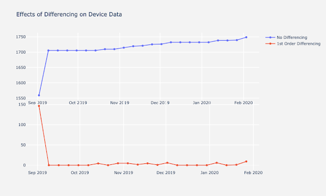
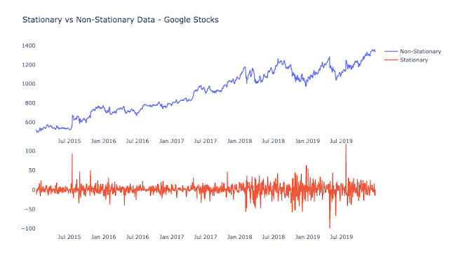
While we did not think we could reliably detect trend, we decided to run a model on differenced “stationary” datasets anyways. We also made models with the multivariate approach to see performance. We made a prior assumption that it would perform worse than a baseline ARIMA. Below is an example device plotted with its non-differenced and differenced data. All other device plots follow similar patterns.

Cisco Prep, Cisco Tutorial and Material, Cisco Learning, Cisco Certification

4) Trained many separate model types and tested them against future values for validation

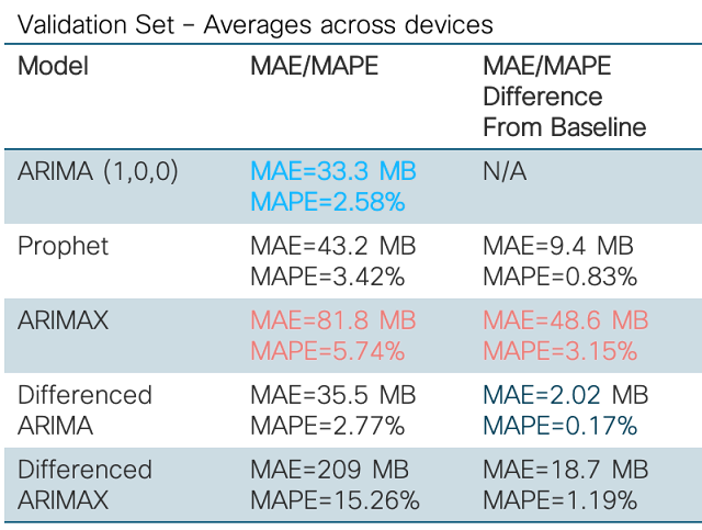
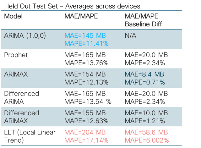
Below are the results of our initial analysis given the data on each device. We tried many different approaches, including ARIMA with a baseline model, Facebook’s Prophet model, ARIMAX, and an exponential smoothing model called local linear trend. Given the constraints of the data at the time, our best approach was a baseline ARIMA model. Results showed that across all devices, models using a baseline ARIMA with parameters p=1, d=0, and q=0 had the lowest MAE and MAPE. Given more data and time to detect the systematic components, we would likely have seen better results with more complex and smoother models. However, given the data we had so far, a simple ARIMA model performed really well!

Cisco Prep, Cisco Tutorial and Material, Cisco Learning, Cisco Certification

Cisco Prep, Cisco Tutorial and Material, Cisco Learning, Cisco Certification

The baseline ARIMA was not without its flaws. Given that most of the data constituted random components, it was very difficult to predict out 2 years for as little data as we had. Thus, you will see forecasting patterns similar to the examples below. Training and testing yields relatively low and good mean absolute errors, whereas forecasts yield higher and worse mean absolute error over time.

Below is an example of a sample prediction on a test set for 2-3 months out using ARIMA(1,0,0). Notice that both the training and testing Mean Absolute Error and Mean Absolute Percentage error are very low.

Cisco Prep, Cisco Tutorial and Material, Cisco Learning, Cisco Certification

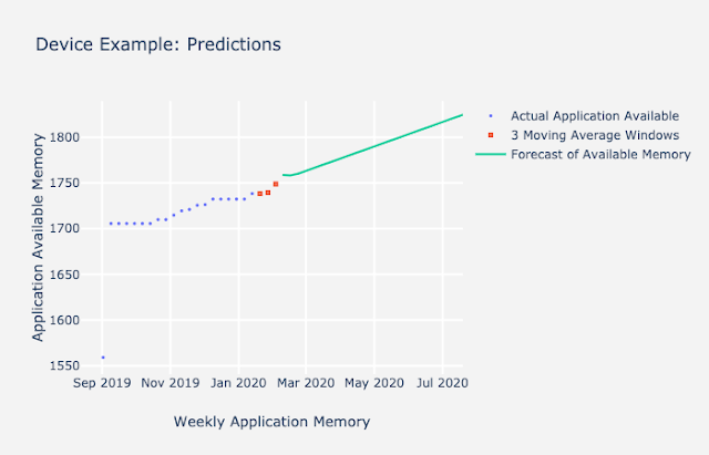
Next, is an example forecast done 6 months out without validation data using ARIMA(1,0,0). Notice the forecast is a straight line and visually you can see that the forecast error is much higher. It shows that a baseline ARIMA cannot adjust forecasts to the random change in the data. Because there was no reliable detected seasonality, cycle, or trend in the data per device, the model was trying to predict random components.

Cisco Prep, Cisco Tutorial and Material, Cisco Learning, Cisco Certification

5) Conclusions and Recommendations

As a result of our initial analyses, we chose a baseline ARIMA model over other more complicated models. In our conclusion, we recommended to the client that they probably shouldn’t be forecasting out more than a couple of months. Instead, they can do rolling predictions out every 2 months as new data comes in and then scale to more complex models once trends or seasonality are spotted in the data.

For some good news on the project, we have recently gotten more data, and we have been able to integrate more complex models that utilize trend data. In our latest dataset for this use case, we have been able to spot trends and been able to make 2 year predictions with much more confidence using a model approach called local linear trend. We used this in our initial model approach but did not have much confidence in it given the data constraints at the time. Fortunately, time series models in general are very flexible given that the data input is simply time and a target variable. Model adaptations are therefore very fast and easy to implement once you understand the basics of time series analysis and have enough data to spot trends and seasonality.

XII. Designing Your Own Time Series Forecasts


Let’s end the blog with some rules you can follow to develop your own time series analysis. This will give you the confidence to start thinking about time series in a new way.

1) Always plot and decompose your data

Always plot and decompose your data. Even if you don’t think there are any trends or seasonality, it’s always good to look at your data!

2) Construct hypotheses about your data after looking at it.

Always construct hypotheses about your data after you look at it. You want to do this so that you can formalize what you think is going on in your datasets and test your assumptions about them. For example, suppose you were asked to predict out 2 years with only monthly snapshots of data. Maybe you don’t think you have enough data to detect trend or seasonality. It is possible that you will find no systematic patterns of trend and seasonality in your dataset. If you do not, know you will most likely be predicting only the random components of your dataset. This will help you make strong, testable conclusions later when presenting to stakeholders.

3) For forecasting, make sure your data are stationary. For some smoothing models you may not need to do this.

Remember the definition and rules of stationarity when using models like ARIMA!

4) If multiple variables are present in your data, try to determine the usefulness of using them in your multivariate time series model.

Can other continuous variables be used as leading indicators or signals to help you predict the next data point? If not, don’t use them! They likely won’t help your forecasts, and might actually make them worse.

5) Choose models that make sense for the data you are given, and don’t be afraid to experiment with model parameters.

The autoregressive and the moving average terms may sometimes cancel each other out under certain conditions. Refer to the post below to help you understand your data better and pick the appropriate lag parameters.

6) Compare model parameters and model types. You will likely find that simpler models are usually better.

Always try using simple models first as a baseline, like ARIMA(1,0,0) or ARIMA(1, 1, 0). Then you can add more complexity if your data has complex systematic components like trend and seasonality. You will likely get better prediction accuracy and lower forecast error as you get more data. Additionally, if you don’t need multivariate analysis, don’t use multivariate analysis. Only use it if you think it will improve your forecasts.

Wednesday, 15 April 2020

Creating Possibilities with Cisco DNA Spaces and IBM TRIRIGA Building Insights

Cisco DNA, Cisco Tutorial and Material, Cisco Learning, Cisco Certification, Cisco Prep

During unprecedented periods of disruption, employee well-being and facility utilization will become top priorities for businesses of various sizes. Given tighter budgets and continued uncertainty, corporate real estate and facilities planning teams will have to determine the most effective and efficient use of their workspaces. To do this, these teams will need space utilization insights, so they can quickly identify changes in their workspaces and make data-driven decisions.

Understanding workspace utilization requires accurate occupancy data across all enterprise spaces, and gathering this data often leads to many challenges that include:

◉ Purchasing, deploying, and supporting new technology architectures

◉ Integrating disparate data sources into a common data lake

◉ Translating large amounts of data into meaningful and actionable insights

Because generating accurate occupancy data through sensors and other technology can be very challenging, space allocation and build/lease decisions are commonly based on manual efforts, historical patterns, and anecdotal evidence.

Given these challenges, how should an enterprise use technology to learn more about their space, both to create an engaging workplace and increase productivity?

Enter Cisco DNA Spaces and IBM TRIRIGA Building Insights, two leaders in their respective markets, partnering to deliver predictive insights and high-value outcomes at scale and through the Cisco Wireless network and software. “Understanding who is using your space and when they’re using it has never been more critical,” said Kendra DeKeyel, Director, IBM TRIRIGA Offering Management. “Our new partnership with Cisco gives clients an easy way to capture that crucial occupancy information in real time, with their existing Wi-Fi network. TRIRIGA Buildings Insights then delivers AI insights from this occupancy data, helping businesses make better-informed space management decisions, and respond quickly to changing demands.”

How to Easily Unlock Occupancy Insights


By leveraging existing Cisco Wi-Fi network infrastructure and wireless access points, Cisco DNA Spaces aggregates location data to provide location data for IBM TRIRIGA Building Insights. There are several ways this can benefit corporate real estate teams, facilities planning managers, and IT Professionals.

By using the wireless network, real estate and facility planning teams can gain historic and real-time visibility into how occupants use the workspace. These teams can realize significant cost savings by re-purposing or scaling back underutilized space. This is done through Cisco DNA Spaces cloud. It normalizes network data to determine occupants, and then delivers this data to IBM TRIRIGA Building Insights.

Planning teams can also understand how different departments use workspaces through the IBM TRIRIGA Building Insights partnership.  By understanding which departments use which spaces, planning teams can ensure that the workspace is optimized for the types of employees who spend the most time there.

For IT teams with existing Cisco Wireless infrastructure, they can deploy this solution without having to provision or upgrade new hardware or onboard new vendors. The Cisco DNA Spaces App Center makes the integration with IBM TRIRIGA Building Insights simple and secure.

Make every space count


With Cisco DNA Spaces and IBM TRIRIGA Building Insights, facilities planning managers can make informed business decisions about whether to expand their buildings, or even scale back on their facilities to save costs. As more data is generated, they can get smart, AI-driven recommendations on build/lease decisions as well. With accurate, real-time occupancy insights, facilities planning managers can ensure that their real estate portfolios are right sized. Most importantly, they have the resources to make the most out of every square foot.

Tuesday, 14 April 2020

Time Series Analysis with ARIMA: Part 2

This is a continuation of the Time Series Analysis posts. Here, I will do a deep dive into a time series model called ARIMA, an important smoothing technique used commonly throughout the data science field.
If you have not read part 1 of the series on the general overview of time series, feel free to do so!

VII. ARIMA: Autoregressive Integrated Moving Average


ARIMA stands for Autoregressive Integrated Moving Average. These models aim to describe the correlations in the data with each other. You can use these correlations to predict future values based on past observations and forecast errors. Below are ARIMA terms and definitions you must understand to use ARIMA!

1) Stationarity: One of the most important concepts in time series analysis is stationarity. Stationarity occurs when a shift in time doesn’t change the shape of the distribution of your data. This is in contrast to non-stationary data, where data points have means, variances and covariances that change over time. This means that the data have trends, cycles, random walks or combinations of the three. As a general rule in forecasting, non-stationary data are unpredictable and cannot be modeled.
To run ARIMA, your data needs to be stationary! Again, a time series has stationarity if a shift in time doesn’t cause a change in the shape of the distribution. Basic properties of the distribution like mean, variance, and covariance are constant over time. In layman’s terms, you need to induce stationarity in your data by “removing” systematic component to make the data appear random. This means you must transform your non-stationary dataset to use it with ARIMA. There are two different violations of stationarity, but this is outside the scope of this post. To understand them, please look at this post: understanding stationarity. There are 2 techniques to induce stationarity, and ARIMA fortunately has one way of inducing stationarity by using differencing, which is in the ARIMA equation itself. There are two different tests called the ADF and the KPSS test to check if your data is stationary or not. After running tests, induce stationarity by transforming your data appropriately until it is stationary.

2) Differencing: A transformation of the data that involves subtracting a point at time t with a value at time t-p, where p is a specified lag value. A differencing of one means subtracting the point at time t with the value at t-1 to make the data stationary. The graph below is applying a differencing order of 1 to make data stationary. All of this can be done in many coding libraries and packages.

Cisco Prep, Cisco Tutorial and Material, Cisco Learning, Cisco Certification, Cisco Cert Prep

3) Autoregressive Lag: These are the historical observations of a stationary time series

The Autoregressive part in ARIMA is tied to historical aspects of the data. 1 autoregressive lag is the previous data point. Two autoregressive lags refers to two previous data points and so on. This is a critical component to ARIMA, as this will tell you how many of the previous data points you would like to consider when making the next predicted data point. Useful techniques for determining how many autoregressive lags to use in your model are autocorrelation and partial autocorrelation plots.

As an example, see these autocorrelation plots and partial autocorrelation plots below. Because of the drop-off after the second point, this indicates you would use 2 autoregressive lags in your ARIMA model.

Cisco Prep, Cisco Tutorial and Material, Cisco Learning, Cisco Certification, Cisco Cert Prep

Cisco Prep, Cisco Tutorial and Material, Cisco Learning, Cisco Certification, Cisco Cert Prep

4) Moving Average Lags: This is related to historical forecast error windows.

The moving average lags refer to the size of the window you want to use for computing your prediction error when training your model. Two moving average lags means you are using the average error of the previous two data points to help correct the predictions on the data point you are predicting next! For the moving average lags, you specify how big your window size will be. These window sizes will contribute to how many data point errors you want to use for your next prediction. Again, it is useful to determine how many lags you use with autocorrelation and partial autocorrelation plots.

5) Lag Order: This tells us how many periods back we go.  For example, lag order 1 means we use the previous observation as part of the forecast equation.

VIII. Tuning ARIMA and general equation

Now that you know general definitions and terms, I will talk about how these definitions tie into the ARIMA equation itself. Below is the general makeup of an ARIMA model, along with the terms used for calibrating and tuning the model. Each parameter will change the calculations done in the model.

Below are the general parameters of ARIMA:

ARIMA(p, d, q) ~ Autoregressive Integrated Moving Average(AR, I, MA)
p – order of the autoregressive lags (AR Part)
d – order of differencing (Integration Part, I)
q – order of the moving average lags (MA Part)

Below is the general formula for ARIMA that shows how the parameters are used. I will break down each parameter and how they fit into the equation.

Cisco Prep, Cisco Tutorial and Material, Cisco Learning, Cisco Certification, Cisco Cert Prep

1) p – order of the autoregressive lags (AR Part)

When p=2 and everything else is 0 – ARIMA(2,0,0), you are using the 2 previous data points to contribute to your final prediction. This can be noted in the equation below and is a subset of the entire ARIMA equation.

Cisco Prep, Cisco Tutorial and Material, Cisco Learning, Cisco Certification, Cisco Cert Prep

The equation gives you a forecast at a particular time if you use p to the order of 2 autoregressive lags. It uses the previous 2 data points and the level at that point in time to make the prediction. For example, the red values below are used to forecast the next point, which would be the first data point on the green line.

Cisco Prep, Cisco Tutorial and Material, Cisco Learning, Cisco Certification, Cisco Cert Prep

2) d – order of differencing (Integration Part, I)

The next parameter in ARIMA is the d parameter, which also the differencing part or integration part. As mentioned earlier, you need to difference your data to make it stationary. When you have non-stationary data, ARIMA can help apply differencing until your data is stationary. The d term in the ARIMA model does this differencing for you. When you apply d=1, you are doing first order differencing. That just means you are differencing once. If you apply d=2, you difference twice. You only want to difference enough to where the data is finally stationary. As I mentioned before, you can check if your data is stationary using the ADF and the KPSS tests. Here are the equations for differencing below. Notice that third, fourth to the nth order differencing can be applied.

Cisco Prep, Cisco Tutorial and Material, Cisco Learning, Cisco Certification, Cisco Cert Prep

Cisco Prep, Cisco Tutorial and Material, Cisco Learning, Cisco Certification, Cisco Cert Prep

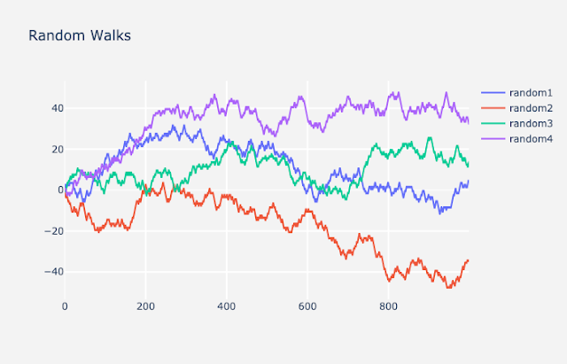
When you apply first order differencing and don’t make any changes to the autoregressive lags or moving average, it is ARIMA(0,1,0), also called a random walk. This means your model is going to generate forecasts without taking into consideration previous data points. Forecasts will be randomly generated.

Cisco Prep, Cisco Tutorial and Material, Cisco Learning, Cisco Certification, Cisco Cert Prep

3) q – order of the moving average lags (MA Part)

Finally, we will talk about the q term. The q term is the moving average part and is applied when you want to look at your prediction error. You will use this error as input for your final forecast at time t. This will be relevant when you are training the data. You can use this parameter to correct some of the mistakes you made in your previous prediction to use for a new prediction. Below is the equation used on the error terms and is the last portion of the general ARIMA equation above:

Cisco Prep, Cisco Tutorial and Material, Cisco Learning, Cisco Certification, Cisco Cert Prep

As you can see below, with ARIMA(0,0,3), the three red data points indicate the window size you will use to help make a prediction on the next point. The next forecasted point from the three red points would be the first data point on the green line.

Cisco Prep, Cisco Tutorial and Material, Cisco Learning, Cisco Certification, Cisco Cert Prep

IX. Measuring if Forecast is good or not

1) Train/Test Splits

Now that you know all the components of ARIMA, I will talk about how to make sure your forecasts are good. When you are training a model, you need to split your data into train and test sets. This is so you can evaluate the test set, as this set of values is not trained during model fit. As opposed to other classical machine learning techniques, in which you can split your data randomly, a time series must be a sequential train-test split. Below is an example of a typical train-test split.

Cisco Prep, Cisco Tutorial and Material, Cisco Learning, Cisco Certification, Cisco Cert Prep

2) Model Forecast Error

After you have finished training your model, you need to know how far your predictions are from the actual values. That is where you introduce error metrics. For the predictions on the test set, you can calculate how far off your predictions were from the actual values using various error metrics. Your goal when making a forecast is to reduce this error as much as possible. This is important as it will tell you how good the forecast is. Additionally, knowing your forecasting error will also help you tune your parameters on the ARIMA model should you want to make changes to the model.

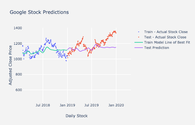
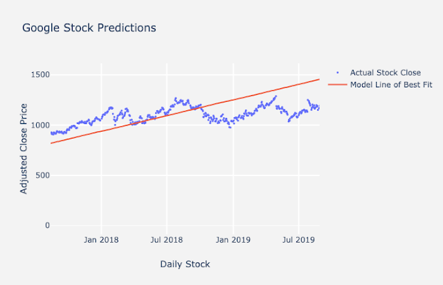
The metrics we generally recommend for time series is mean absolute error and mean absolute percentage error. Mean absolute error (MAE) is a single number, and it tells you on average how far your predictions are from the actual values. Mean average percentage error (MAPE) is another metrics we use, and it is the mean average error expressed as a percentage. This will tell you how “accurate” your model is. The equations for MAE and MAPE are below as well as a plot of Google stock predictions on a train-test split. You can calculate the error on the predictions using the equations below. Notice that you will use the forecasts on the purple line and the red data points to help calculate MAE and MAPE for your test set.

Cisco Prep, Cisco Tutorial and Material, Cisco Learning, Cisco Certification, Cisco Cert Prep

Cisco Prep, Cisco Tutorial and Material, Cisco Learning, Cisco Certification, Cisco Cert Prep

Cisco Prep, Cisco Tutorial and Material, Cisco Learning, Cisco Certification, Cisco Cert Prep

In the example plot above, the line represents your model fit and predictions while the dots represent the actual data. To get the mean absolute error at each time point, you subtract the actual data from the prediction (the points represented as a line in this graph) to get the error. You sum those up and divide by the total number of points. For the forecast on the test set here, the mean absolute error was $72.35, which means on average, each prediction was off by around $72.35. Additionally, the mean absolute percentage error is 5.89%, which tells us that the overall “accuracy” of the model is around 94.11%.

Overview of Steps for tuning ARIMA

Now that you know all of the steps in detail, below I will overview how you want to think about each parameter and steps you would take to train your ARIMA model.

1) Identify the order of differencing, d, using stationarity tests.

2) Identify the order of the autoregression term, p, using ACF plots as rubrics.

3) Identify order of the moving average term, q, using ACF plots as rubrics.

4) Optimize models to minimize error on test data using mean absolute error and mean absolute percentage error after doing a train-test split.

X. Multivariate Forecasting: A Brief Glimpse

Now that you know the basics of tuning ARIMA, I want to mention one more interesting topic. Everything detailed above was in concern of forecasting on one variable. This is called univariate time series. Another important concept arises when you want to predict more than one variable. This is called multivariate forecasting. This will be an important concept that I talk about in Part 3 of the blog series about time series, where I introduce a Cisco use case.

Why would you want to introduce more variables into a time series? There might be a chance that other variables in your dataset might help explain or help predict future values of your target variable. We call these leading indicators. A leading indicator gives a signal after the trend has started and is telling you to pay attention!

For example, let’s say you own an ice cream shop and it is summertime. PG&E cuts off your electricity. You can probably predict that in the future, ice cream sales will go down. You have no electricity to store and make your ice cream in the sweltering heat. The turning off and turning on of electrical power would be a great example of a leading indicator. You can use this indicator to supplement the forecasting of your sales in the future.

There are plenty of Multivariate ARIMA variations, including ARIMAX, SARIMAX, and Vector Autoregression (VAR). I will talk about ARIMAX briefly in the next post.

Cisco Prep, Cisco Tutorial and Material, Cisco Learning, Cisco Certification, Cisco Cert Prep

Saturday, 11 April 2020

Time Series Analysis with ARIMA: Part 1

PART 1: Introduction to Time Series


At Cisco, our partners and clients want ways to track and monitor their Cisco routers, switches, and other such devices. An important avenue of my work as part of the Customer Experience Data Incubation Team is to help track device utilization over time. One such way to think about how device utilization changes over time is to frame it as a time series. In this blog post, I will give a full break down of time series and ARIMA, why it is important, what it is, and how to use it – with a Cisco use case as well! This blog post will give a picture of some of the work the Data Incubation Team has done as part of the Customer Experience portfolio.

I. What is a Time Series?

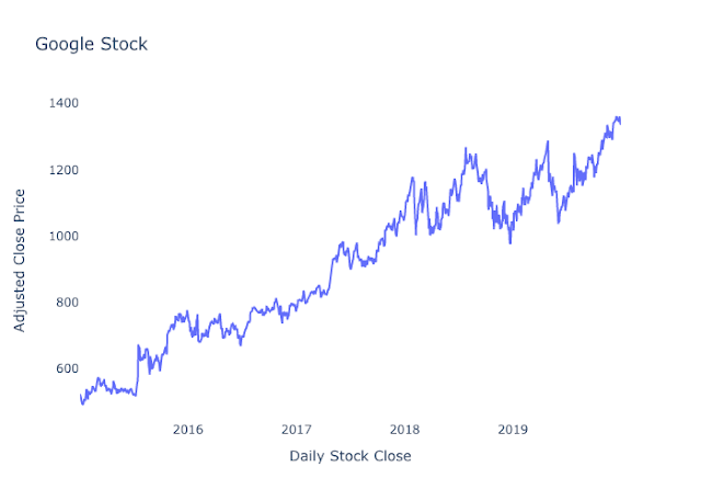
So, what is a time series? It’s actually a very simple concept. A time series is simply a set of values of the same entity observed over time, typically in equally spaced intervals. It can be monthly, yearly, weekly, daily, hourly, and by the minute. A few of examples of a time series include weekly gas prices, yearly temperature change, hourly passenger count on the subway, and any stock market app you look at. Below is an example of a time series using Google’s Stock. I will use this example for the majority of the blog.

Cisco Cert Exam, Cisco Prep, Cisco Guides, Cisco Learning, Cisco Tutorial and Material, Cisco Analysis

II. Why Do We Care About Time Series?

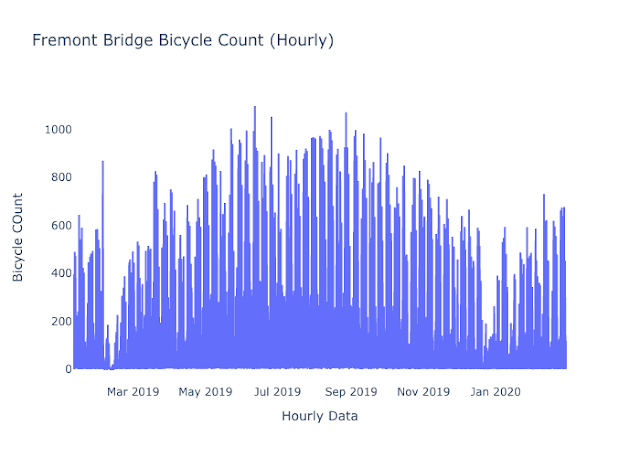
So why is understanding time series data important? If you want to predict something in the future or understand trends over time, you will want to use time series analysis. For example, maybe you want to track sales and predict sales in the future. Maybe you want to breakdown your sales over time to see if there is a trend or cycle associated with it. Any sort of data tracked over time can be used for time series analysis! Below is another example of time series, which tracks the hourly bicycle count.

Cisco Cert Exam, Cisco Prep, Cisco Guides, Cisco Learning, Cisco Tutorial and Material, Cisco Analysis

III. Components of a Time Series

Now that you know what and why of time series, let’s break down its components. This will be important when we start talking about ARIMA in the next post.

Let’s say you have your observed values, D. These observed values, D, can actually be broken down into 2 main components: Systematic components and Random components. Systematic components are data that can be forecasted, while random components are data that cannot be forecasted. I will break down both the systematic components and random components in a series of definitions below.

◉ Systematic Components, S – Data that can be forecasted. Systematic components can be further broken down into 3 parts.

◉ Level, L – It is the intercept of the straight-line approximation of the current observed values D, like a regression line or line of best fit. Level is generally used as initial input to forecast models.

Cisco Cert Exam, Cisco Prep, Cisco Guides, Cisco Learning, Cisco Tutorial and Material, Cisco Analysis

◉ Trend, T – It is the slope of the rate of growth or decline of your observed values, D. This slope or rate will decline, incline, or be constant throughout the time series.

Cisco Cert Exam, Cisco Prep, Cisco Guides, Cisco Learning, Cisco Tutorial and Material, Cisco Analysis

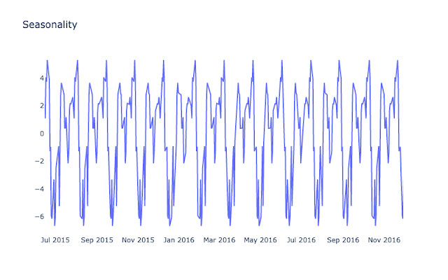
◉ Seasonality, S or Cycles – They are the predictable seasonal or non-seasonal fluctuations in your observed values, D. In other words, your data has seasonality if the data has variations that occur in regular intervals (weekly, monthly, etc.) throughout a year. For example, Nintendo Switch console prices and games lower every 3 months, then come back up after a week. This is considered a seasonal component.

Cisco Cert Exam, Cisco Prep, Cisco Guides, Cisco Learning, Cisco Tutorial and Material, Cisco Analysis

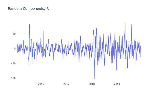
◉ Random Components, R – This might be anomalous behavior, irregularities in the data, and unexplained variation. These are all things that typically cannot be controlled, and they are inevitable in almost every dataset.

Cisco Cert Exam, Cisco Prep, Cisco Guides, Cisco Learning, Cisco Tutorial and Material, Cisco Analysis

IV. Main Goals when Given Time Series

Now that you know what a time series is and the components, you may be wondering what you can do with it. When given a time series, you either want to decompose the components of your time series data or forecast and make predictions based on your data. Let’s talk about both techniques below.

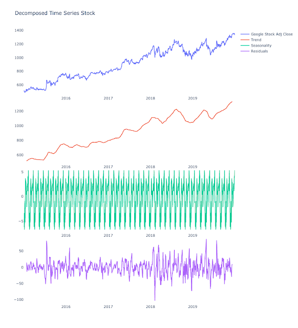
◉ Decomposition: This is the breakdown of data into sub-components, including trend, seasonality, and randomness and can be done to look at important parts of the time series. Maybe sales on your services have a seasonal or cyclical component to them and you want to use that to improve sales at a certain part of the season. That is where decomposing a time series can be helpful. You can visualize and identify specific factors and trends in your data that impact its growth or decline. Below is a breakdown of the components of Google’s stock.

Cisco Cert Exam, Cisco Prep, Cisco Guides, Cisco Learning, Cisco Tutorial and Material, Cisco Analysis

◉ Forecasting: Another goal of time series is forecasting the future. For example, you may want to predict when some hardware or device might crash in the future based on their historical data. This can help companies make proactive or preventative measures to fix the problem before it happens instead of reacting to the problem as it happens. As a result, this can save time and money for companies and clients. Below is an example of the forecast of Google stocks given its current seasonality, cycles, and trends.

Cisco Cert Exam, Cisco Prep, Cisco Guides, Cisco Learning, Cisco Tutorial and Material, Cisco Analysis

V. Forecasting Rules of Thumb

Now that you understand some of the cool things you can do with time series, I will now go over rules that are critical to know if you want to do forecasts on your data.

Rule #1 – Always plot your data before, during, and after forecasting!

You always want to check how the data is distributed over time or how the model is forecasting by plotting the data. The process is quick and gives an idea on how to approach the problem or make adjustments to the model.

Rule #2 – You can only forecast the systematic components of the observed data – Level, Trend, Seasonality

You may not predict the future very well if you do not see any of those systematic components of trend, seasonality or cycles after decomposing your time series. There may be a promising project you work on that might have uneven and irregular data. For example, maybe the stock price swings if someone sends out an innocuous tweet. You can see the how that tweet impacted your time series by looking at the residuals or the random components. This type of swing may be something you will likely not be able to predict.

Rule #3 – The random components, R, cannot be predicted

As mentioned before, random components are sudden changes occurring in a time series which are unlikely to be repeated. They are components of a time series which cannot be explained by trends, seasonal or cyclic movements and they are usually not repeated. For example, during times of the coronavirus, stock prices were very volatile and while there was a general downward trend, much of the day-to-day activity was random. If your data only have random components, it will be harder for you to make an intelligent time series forecast.

VI. General Forecasting Techniques – Univariate Time Series

Now that you understand some important concepts for forecasting, I will outline two different forecasting techniques used as industry practice today, starting from simple regressions to smoothing.

◉ Regressions find a straight line that best fits the data. This is also known as static forecasting.

1. EX: Least Squares (using linear regression)

Cisco Cert Exam, Cisco Prep, Cisco Guides, Cisco Learning, Cisco Tutorial and Material, Cisco Analysis

◉ Smoothing determines the value for an observation as a combination of surrounding observations. This is also known as adaptive forecasting. ARIMA utilizes smoothing methods. Smoothing has additional tools that a simple regression does not have and makes modeling more robust. Smoothing techniques are more commonly used today, but regressions are often useful to get a general idea of how your data is moving.

1. EX: moving average, exponential smoothing models, ARIMA models

Cisco Cert Exam, Cisco Prep, Cisco Guides, Cisco Learning, Cisco Tutorial and Material, Cisco Analysis

Friday, 10 April 2020

Three Network Challenges IT Can Solve to Drive Business Continuity

Similar to what most of our customers are doing these days, the majority of my working hours are spent working from my home office. It’s not a new experience for me. At Cisco, we have always been good at using our own technology to run our business, so working from home is common for most Cisco employees.

My home office setup provides me with the same experience I’m used to in the office – same secure corporate Wi-Fi network run off a Cisco access point, a Cisco DX video end point for Cisco Webex meetings and nothing more.

This is exactly the need we are seeing at our customers, as they look to enable their remote workforce. A secure solution, deployed quickly and at scale.

Never in recent memory has IT around the world needed to address a crisis such as this in such a short time. Never in recent history has the network played such a crucial role in keeping businesses going when everything else stops.  IT and the network are now at the forefront, the only enabler for businesses to continue operating.

Business continuity is the name of the game, but what are the easiest ways to get that critical element of network connectivity up and running?

Let’s unpack the three main challenges that customers are struggling with today:

Cisco Tutorial and Material, Cisco Study Materials, Cisco Guides, Cisco Learning

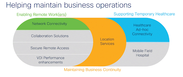
Enabling Remote Work(ers)


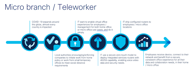
With a pandemic like this one, governments are attempting to slow down the spread of the virus by enforcing strict social distancing guidelines, which means businesses across all industries, geographies and sizes are closing their physical spaces. Employees are expected to work, but from their home or as a small team in a micro office.  And IT is being asked to provide the secure network connectivity.

There are several ways to do this – via a VPN connection, a virtual office router deployed at home and providing not only connectivity but also security, Wi-Fi, switching and more, or by setting up access points that bridge to the corporate network. Although Cisco has offerings to address all three options – I will discuss the latter two.

Cisco Tutorial and Material, Cisco Study Materials, Cisco Guides, Cisco Learning

Many customers I speak to have old and un-used access points, usually sitting in a warehouse and collecting dust after being replaced by newer generation AP’s. IT can re-purpose these by centrally configuring them to be Office Extend Access Points (OEAP). IT can also temporarily pull, say, every third access point from the office ceiling and use those for home connectivity.

IT can then ship the access points to the employees home, who would connect them to their home network and voila!, within minutes are able to securely log onto the corporate Wi-Fi network, with no need to log-in through VPN every time.

Almost any Cisco Aironet or Catalyst access point can be used, going three generations back to 11n AP’s.

Customers can also leverage the Wireless LAN Controller’s free 60-90 days evaluation license to deploy any wireless LAN controller, virtual or physical, so investment is minimal.

Customers that are looking to manage their network with a central cloud management dashboard can deploy Cisco Meraki’s remote work offers that build on Meraki’s Security & SD-WAN, Teleworker Appliances (MX, Z) and Access Points (MR), which have the capability to securely extend a corporate network into the home. Meraki Insight (MI) gives IT admins a view into the performance of cloud-based applications (WebEx, O365, G-Suite, etc.) and Meraki Systems Manager (SM) keeps school/government/enterprise issued devices secure when those are off the network, and assists in the rapid deployment of security offerings (Duo, Umbrella, Clarity, etc.).

And finally, customers can also set up teleworker, and small branch offices using Cisco ISR 1K devices. For environments where there is no network already present, like in pop-up healthcare facilities, Cisco ISR1K routers offer advanced LTE/cellular options for expanded WAN coverage, backhaul over cellular, backup/fail-over connectivity and active-active configurations.

While this solution might require more time for planning and deployment, it offers the most robust capabilities, is SD-WAN ready and can serve the business future needs beyond the pandemic.

Cisco Tutorial and Material, Cisco Study Materials, Cisco Guides, Cisco Learning

Keeping consumer businesses running


While in many industries work from the workplace is put on hold, there are some consumer- oriented businesses like retail, healthcare, and transportation – where operation is essential.

What can be done to provide shoppers with a safe experience when they go to shop for food? How can airports maintain the health of their travelers and staff? How can hospitals track location of critical devices?

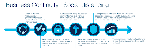
Location based network analytics, enabled by Cisco DNA Spaces, can provide the right insights, and is available to customers for 90 days at no cost. Cisco DNA Spaces, which provides wireless customers with rich location-based services, including location analytics, engagement toolkits and enterprise integrations, enables businesses to use technology in order to solve this physical challenge.

Cisco Tutorial and Material, Cisco Study Materials, Cisco Guides, Cisco Learning

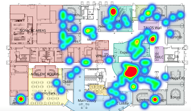
For instance, by leveraging the existing Cisco wireless network at the retailer, IT can provide the security staff access to the Cisco DNA Spaces dashboard so they can monitor the real-time clustering of devices to enforce social distancing at the retailers physical space, by looking at heatmaps overlaid on the business’s floor plan. IT can also push notifications to devices where policy is being overridden.

Cisco Tutorial and Material, Cisco Study Materials, Cisco Guides, Cisco Learning

Another use case focuses on guest engagement. Imagine you go to a pharmacy. You obviously want to spend the least time possible inside the store. Cisco DNA Spaces’ captive portal capability can enable you to check-in when arriving to the pharmacy’s parking lot, and when your turn comes, the business will notify you to come in and conduct your shopping. That way the business can have control over the amount of shoppers on location, reducing health risks.

Other use cases include leveraging Cisco’s partnerships with healthcare solutions providers such as Stanley Healthcare, where the need to track critical assets related to Covid-19 patients, such as respirators or even nurse panic buttons can be enabled by using Cisco DNA Spaces and Stanley Healthcare’s RFID tags.

Supporting temporary healthcare


As many of you have already seen, due to the risks associated with this virus, healthcare providers  are deploying temporary facilities such as screening zones, drive-through clinics, as we as full-fledged temporary hospitals, to address the influx of patients, while containing the risk of spread to other patients and staff.

These can be adjacent to the healthcare providers campus where an existing network can extend out, for instance setting up a screening tent in the parking lot of the hospital. Or it can be a mobile field hospital or screening location set up in a nearby location, school or stadium, where there is no available network.

The quickest way to address this challenge is to leverage the existing indoor wireless network, using external directional or omni antennas, to extend to the nearby facility.

Another way is by deploying a wireless mesh solution where one access point is connected to the wired network, and other access points connect to it over Wi-Fi. Almost any AP can operate in this mode and a combination of indoor and outdoor AP’s can be used.

Other options include Mobility Express access points, Meraki access points, point to point bridging or Cellular based wireless backhaul solutions.

The network IS the enabler for business continuity, and the role of IT is immensely important. Although IT companies might not be considered essential businesses per government taxonomy, IT is essential to maintaining business continuity. I’m sure your account team is ready for any ask or question you may have, and I encourage you to reach out for help, as we are all in this together, in solidarity.

Thursday, 9 April 2020

Buyers Beware: Scamming Is Rife, Especially In a Time of Crisis

For years, scammers have been using a combination of Blackhat SEO techniques, phishing sites and newsworthy events to either trick individuals into giving up personal information including credit card numbers or to install malware or both. Preying on an individual’s fears has always been a go to tactic for scammers.

Recently a friend texted me and asked if I could take a look at a website his wife used to try and buy some 3M N95 face masks from. He was concerned that the site did not appear to be legitimate. “Sure”, I said, “What is the domain?” He sent it over. mygoodmask[.]com. Having spent the last decade looking at malware, spammers and scammers, I responded immediately, “Yes, it’s very bad. Tell her to cancel her credit card as soon as possible.”

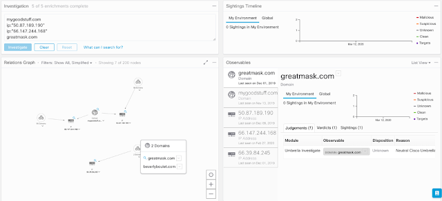
I figured I’d take a closer look at the domain to confirm if I was right. Dropping the domain into Cisco Threat Response – our platform that accelerates investigations by automating and aggregating threat intelligence and data across your security infrastructure. Threat Response didn’t return anything useful aside from the IP Addresses it resolved to. Since the platform is configured for my test organization at the office, it’s not going to show me any hosts that may have visited that domain, but it is still a great source of intelligence. It showed that Cisco was aware of the domain, but there was no additional information – not surprising for newly created and used domains. There is more than one way to determine if a domain is suspicious.

Cisco Prep, Cisco Learning, Cisco Tutorial and Material, Cisco Guides

Enriching the two IP addresses, 50[.]97.189.190 and 66[.]147.244.168, returned everything I needed to decide that the original site was malicious. Nearly two hundred domains resolving to those two addresses, none of which looked like ones I’d like to end up on.

Cisco Prep, Cisco Learning, Cisco Tutorial and Material, Cisco Guides

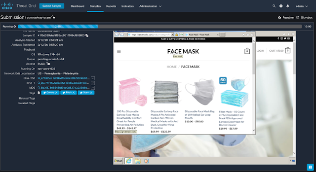
At this point I was curious about the website itself and wanted to take a closer look. I submitted the domain to Threat Grid, Cisco’s malware analysis tool. It immediately redirected to greatmasks[.]com which resolved to 37[.]72.184.5. Using Glovebox, a capability in Threat Grid that allows full interaction with the virtual machine, I attempted to buy some masks from the website. I used an expired card number to purchase my masks. They are using PayPal to collect payments and validate card numbers.

Cisco Prep, Cisco Learning, Cisco Tutorial and Material, Cisco Guides

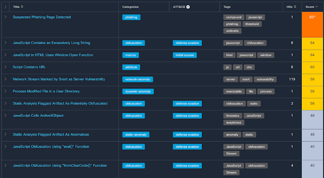
The results produced from the analysis highlighted further details on the website, indicating a high level of suspicious activity.

Cisco Prep, Cisco Learning, Cisco Tutorial and Material, Cisco Guides

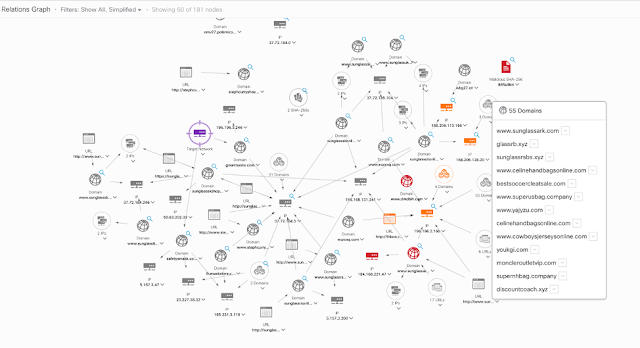
Drilling down on the IP address that the new domain resolved to, we found another related domain, safetysmask[.]com. At this point it would be easy to create a new Casebook and add these observables to the investigation.

Cisco Prep, Cisco Learning, Cisco Tutorial and Material, Cisco Guides

Cisco Prep, Cisco Learning, Cisco Tutorial and Material, Cisco Guides

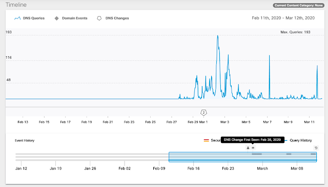
For me, one of the most telling signs of an unknown domain is the lookup frequency and activity mapped to the domain creation date and DNS changes. A scammer may register domains and park them until they’re ready to use them. At that point they’ll set up a website and point that domain to an IP.

Cisco Prep, Cisco Learning, Cisco Tutorial and Material, Cisco Guides

Looking at the timeline and domain lookup activity in Cisco Umbrella, our DNS-layer SaaS solution, it’s clear that this website has been up for less than a month which is unusual, especially in context of this investigation.

Cisco Prep, Cisco Learning, Cisco Tutorial and Material, Cisco Guides

Using a combination of our platform capability and our DNS-layer security, I was able to validate that this domain, IP Addresses, and related domains were malicious. With investigations of this nature, the domain or IP might not always have a known disposition at a certain point in time but often, by following the breadcrumb trail of related information, it’s easy to make a determination and judgement about the original domain. Another path to determining the disposition of these domains is to drill down into the observables in Umbrella.

Cisco Prep, Cisco Learning, Cisco Tutorial and Material, Cisco Guides

Cisco Security products not only integrate via Threat Response, there are multiple direct integrations between products as well. These integrations are used to share threat intelligence produced by individual products and to share capabilities across products through API integrations, data visualization and cross product capabilities such as Casebook’s browser plugin.

Umbrella, our cloud-delivered DNS- layer of protection, integrates with Threat Grid, our malware analysis tool, and this allows Umbrella to show information produced through dynamic analysis, mapping domains and IP addresses to samples seen in Threat Grid’s global database, providing another method of determining disposition.

By the end of my digging, I had found hundreds of scams related to sports events, fashion accessories, flu season and more. All easily searchable within your organization via Threat Response and just as easily blocked via Umbrella.

Cisco Prep, Cisco Learning, Cisco Tutorial and Material, Cisco Guides

What began as just a way to help a friend one evening, became a quick but comprehensive investigation into how bad actors are trying to capitalize on a global health crisis. Hopefully this was helpful in showing how easy it can be to validate the disposition of a domain using related observables, and in doing so, build out a collection of new content to be leveraged in your environment for detection and prevention.